
Wedding
Visual Identity
event visuals // menu
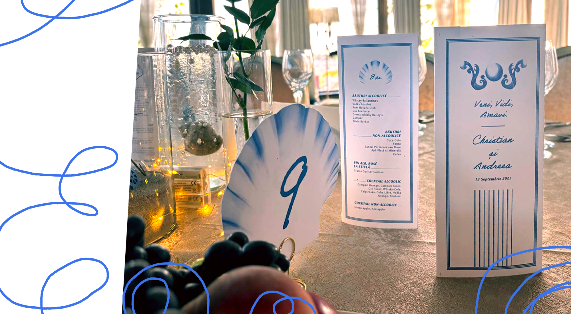
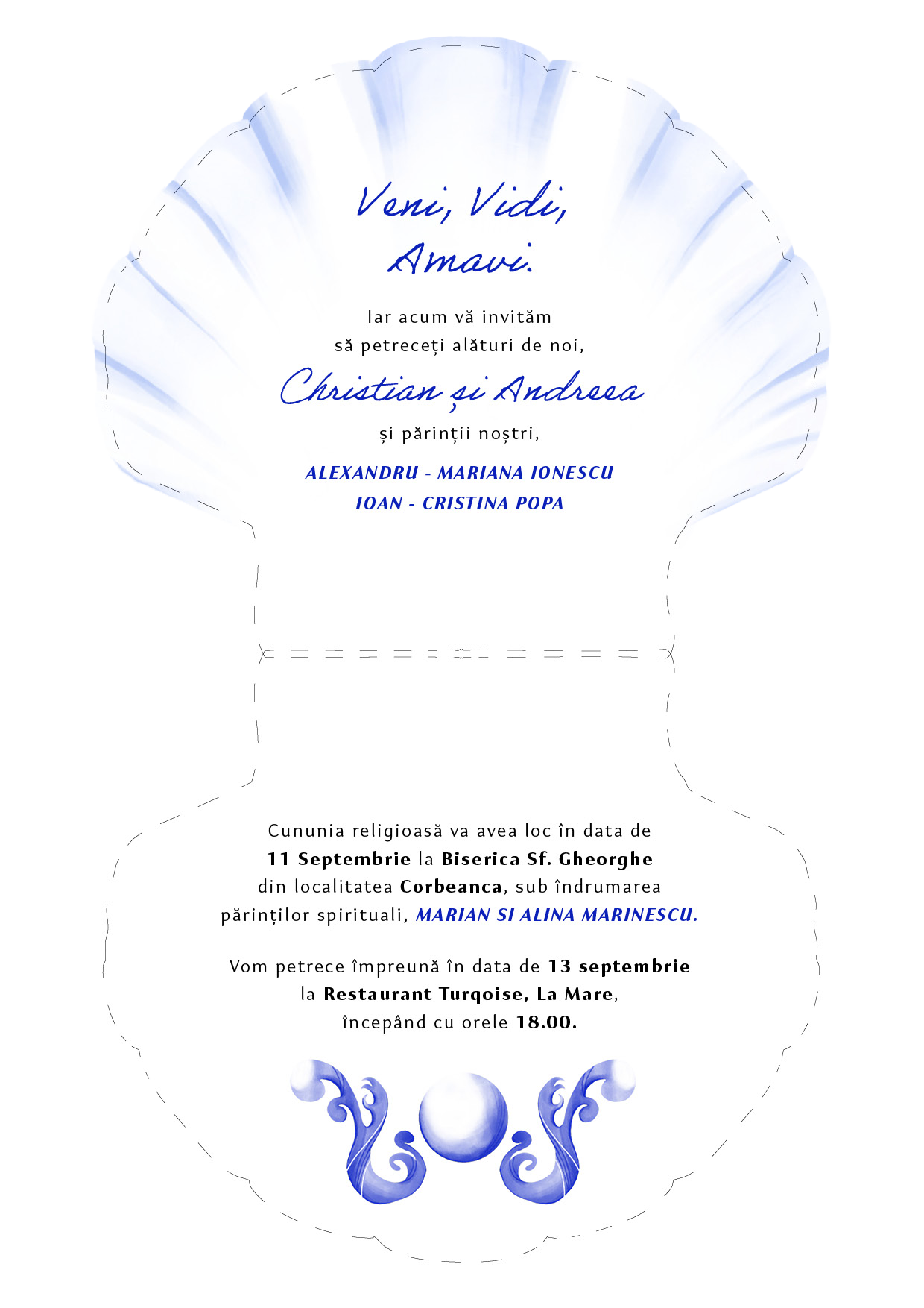
This wedding’s theme was “by the seaside” and I pushed it further by adding the latin tagline and the Roman motif of the column, building a romantic atmosphere of a dreamy evening by the sea, a glimpse into the ancient world that used to be there, where they laid.
The tagline, “Veni, Vidi, Amavi.” (We came, we saw, we loved), a play on the iconic line of “Veni, Vidi, Vici.”, suggests the idea of instant love and a joyful union. Moreover, by being in latin, it brings a timeless quality to the couple’s love.
The visual identity included printed invitations, digital invitations in the form of a GIF, a menu and table numbers.
“Working with Alexandra made my life as a bride so much easier, she used our ideas and moodboard in an original way and helped us paint the picture of our dreams.” - Andreea
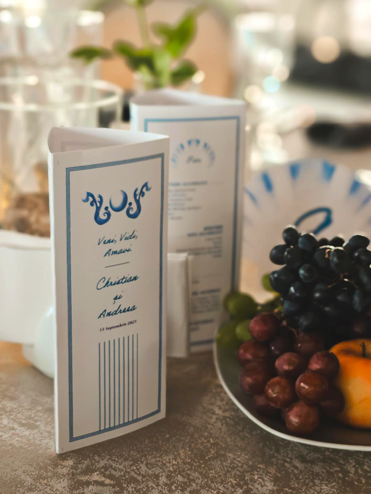
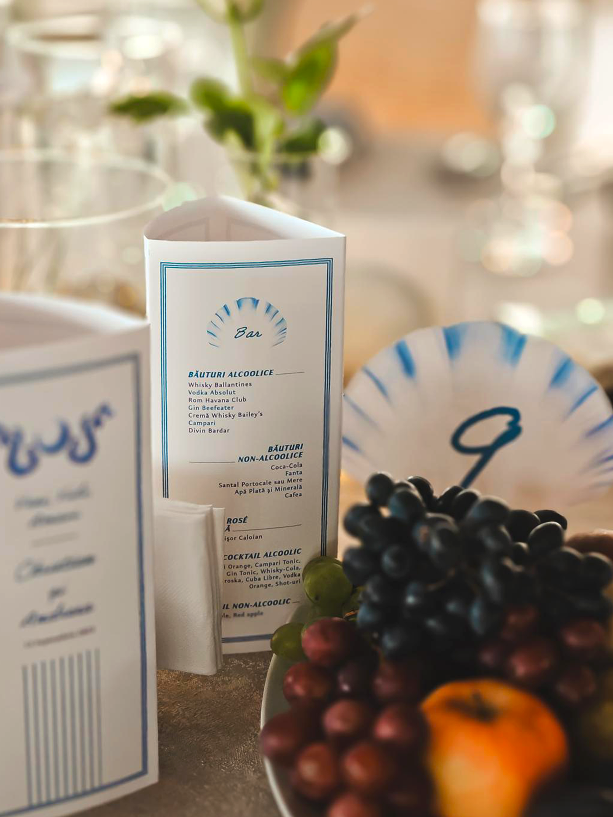
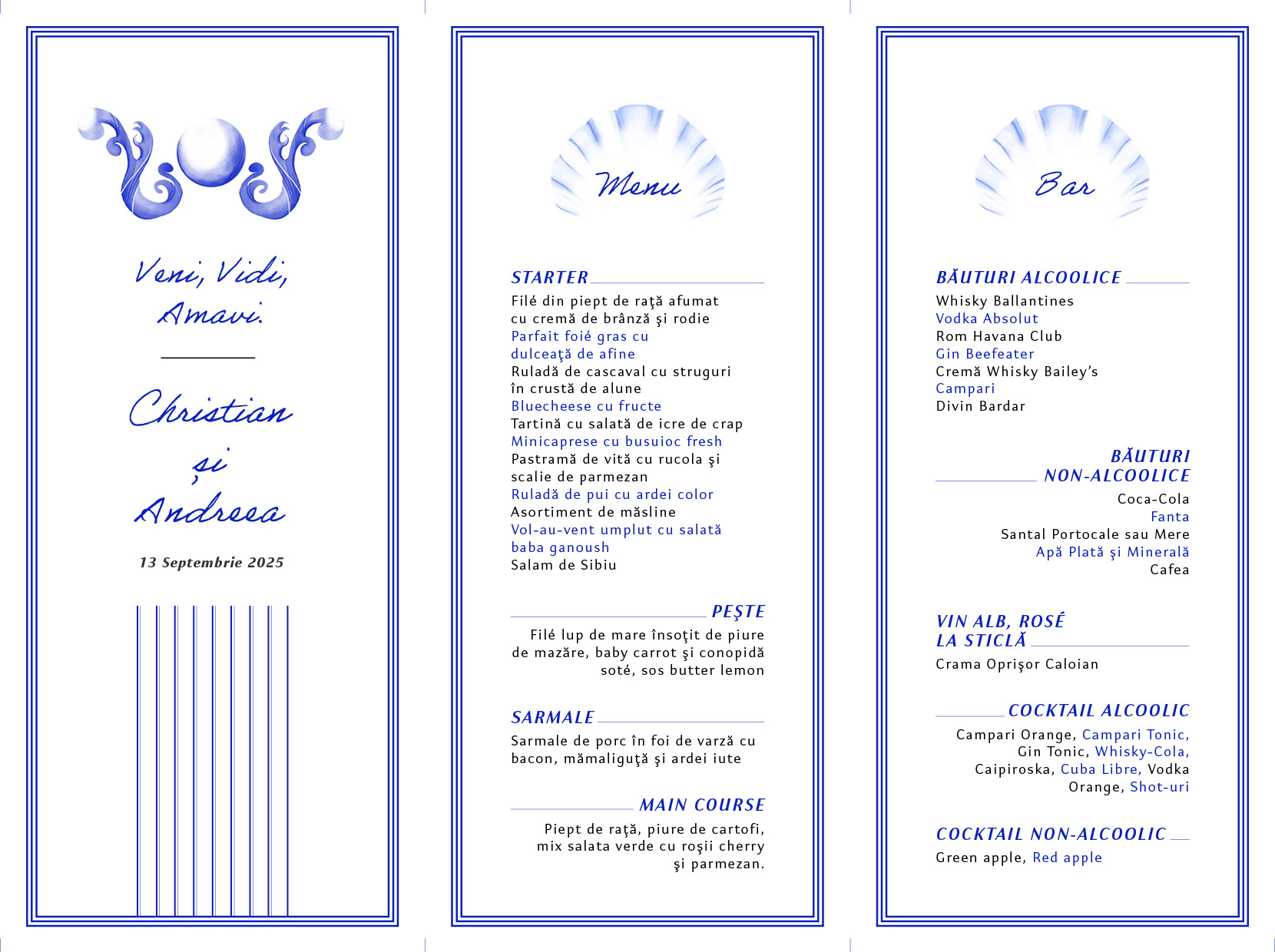
The menu is split between food and drinks and has a dynamic design that improves readability, by oscilating between indentation and text colours.
It comes together to bring all the motifs of the visual identity together for an unforgettable night.
It comes together to bring all the motifs of the visual identity together for an unforgettable night.

It Didn’t Start With You
Book Cover
non-fiction // science
The cover represents a cycle of rot: how unresolved trauma can be passed down through generations. Such trauma can manifest in many ways, but my cover focuses on the most common, agressiveness. The rot is suggested both through the colours of the apples and their degradation.
The family, the apple, gets eaten away by such behaviours, leading to its core. The screaming shapes within the apple bites are subtle and hard to see at first sight, similar to the way these problems can be ignored, until they force us to see them. Within the shadows we find two characters, who take turns yelling at each other, passing down their trauma.
To highlight these shapes, the apples would we embossed on the front cover.

The cover on the right represents the initial colour scheme which was changed to better suit the scientific genre and give a more “clinical” vibe as this book is more than psychology, looking into DNA research and trauma.
Full cover for the observation of the details in the face shapes.

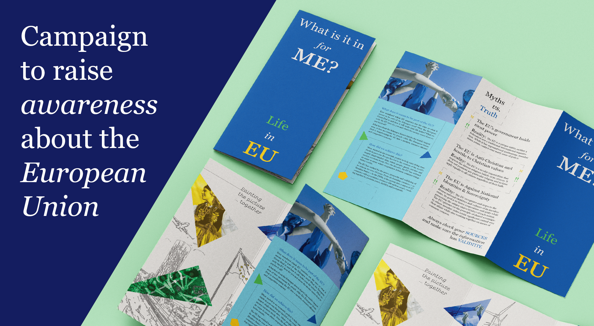
EU Info Campaign
brochure// social-media posts
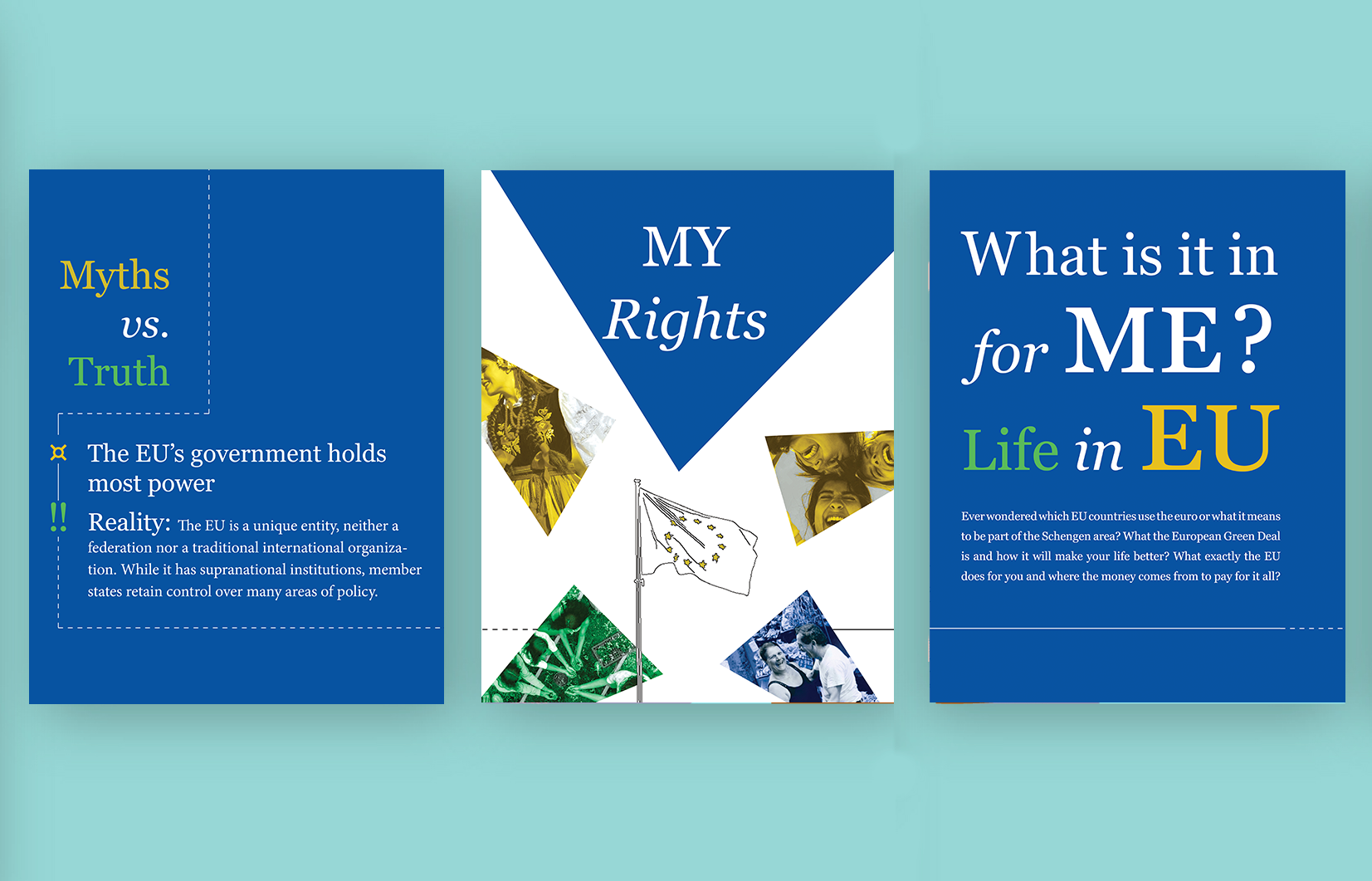
This project was meant to be a reflection of the current wave of misinformation that is spread about the European Union and to come as a reinforcement of what the EU has meant for its citizens and what its citizens stand to gain. The tagline “What is it in for me?” aims to highlight the benefits of being an EU citizen and counteract the misinformation that suggests the EU has interests other than those of its people.
This brochure focuses on accessible design, using an accessible font and limited colour, and is designed to be easy to print, even at home or in schools, in order to spread its message. The vision of this brochure is to paint the journey and idea of what living in the EU does for its citizens. It is straightforward in its message, touching on important points. The brochure is easily translated in social media posts that promote the brochure.
This brochure focuses on accessible design, using an accessible font and limited colour, and is designed to be easy to print, even at home or in schools, in order to spread its message. The vision of this brochure is to paint the journey and idea of what living in the EU does for its citizens. It is straightforward in its message, touching on important points. The brochure is easily translated in social media posts that promote the brochure.
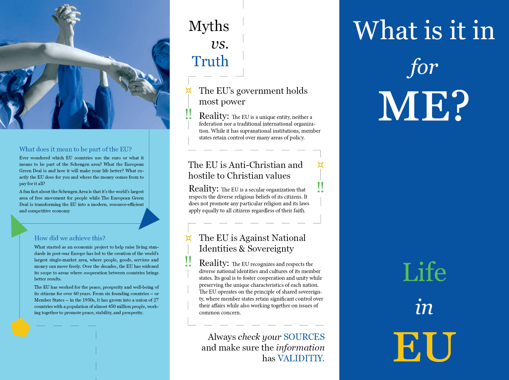
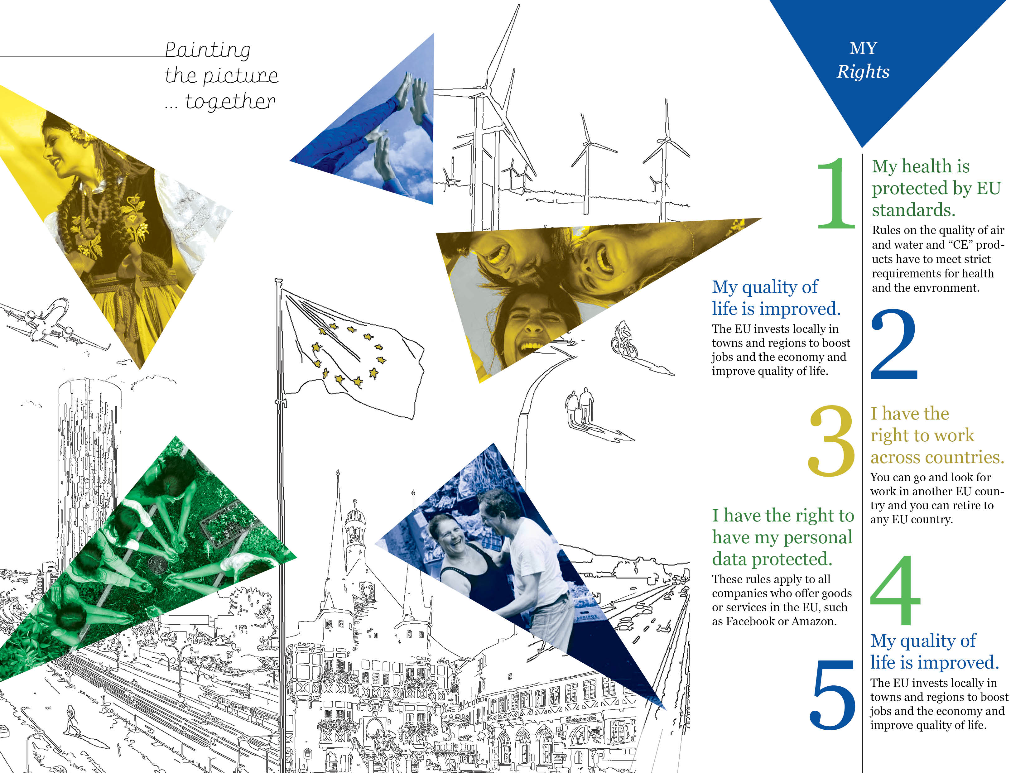
The design you see when you open the leaflet is almost childlike, inviting people of all ages to interact and even help paint the picture by colouring it. It features images of travel, developed Eastern European cities, the legacy of the European culture, as well as its growth and focus on environmentalism.
The “myth vs truth” section touches exactly on misinformation and what it usually focuses on. Overall, it is a lighthearted, optimism-focused leaflet that reminds its readers of how being in the EU might have improved their life.
The “myth vs truth” section touches exactly on misinformation and what it usually focuses on. Overall, it is a lighthearted, optimism-focused leaflet that reminds its readers of how being in the EU might have improved their life.
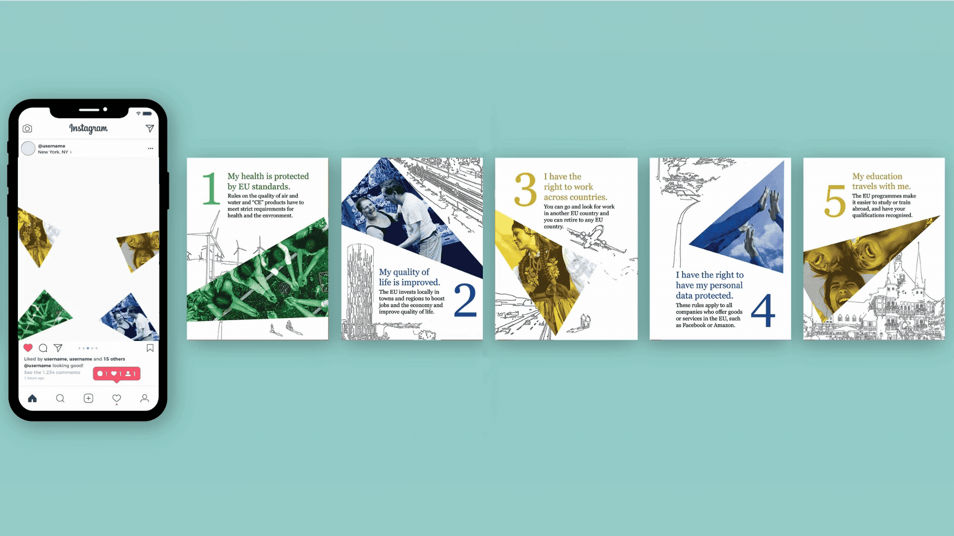
The three posts easily cover the contents of the brochure, sending a clear message and making it accessible and engaging through animations and carousel-type posts made for Instagram. Each post has in its description a download link for the brochure that can be printed at home.

A Season
In Hell
Book Cover
classic // poetry
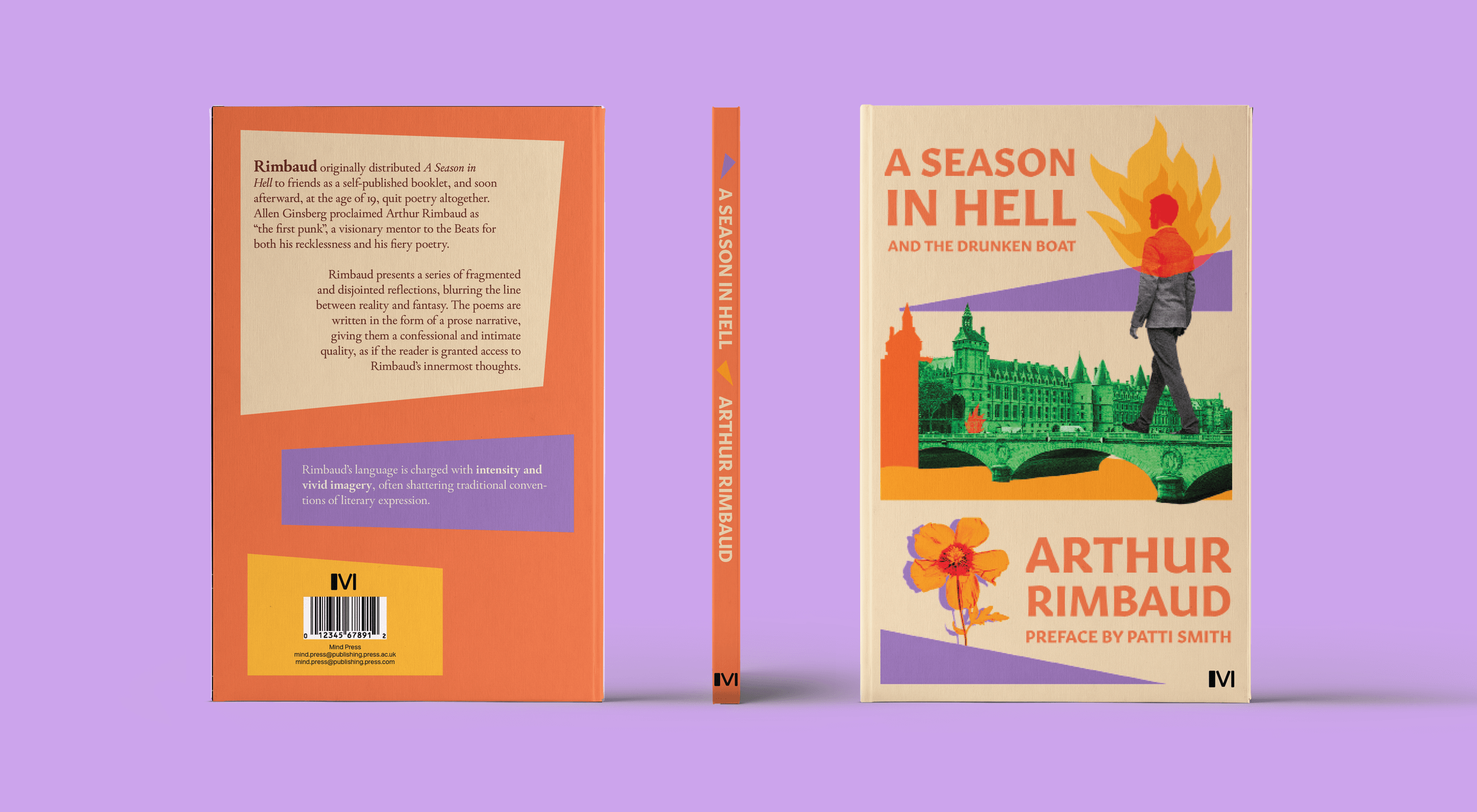
The cover encapsulates Rimbaud’s surreal style of writing, with metaphors and symbols in abundance, while portraying his own journey as well. He lives in a city that feels alienating and brings all emotions to the surface and at high intensity, the scarce nature being a solace.
I used vibrant colours to highlight the intense and dynamic nature of his poetry. In spite of all the doom and hopelessness he expressed, it is hard to ignore the hope that is also present as something to cling to.
I used vibrant colours to highlight the intense and dynamic nature of his poetry. In spite of all the doom and hopelessness he expressed, it is hard to ignore the hope that is also present as something to cling to.

The cover presents a story of a young man walking in Paris, overwhelmed by thoughts and unable to connect to his surroundings, nature being a scarce yet powerful sight.
Mass-market Book Series
accessible // any genre
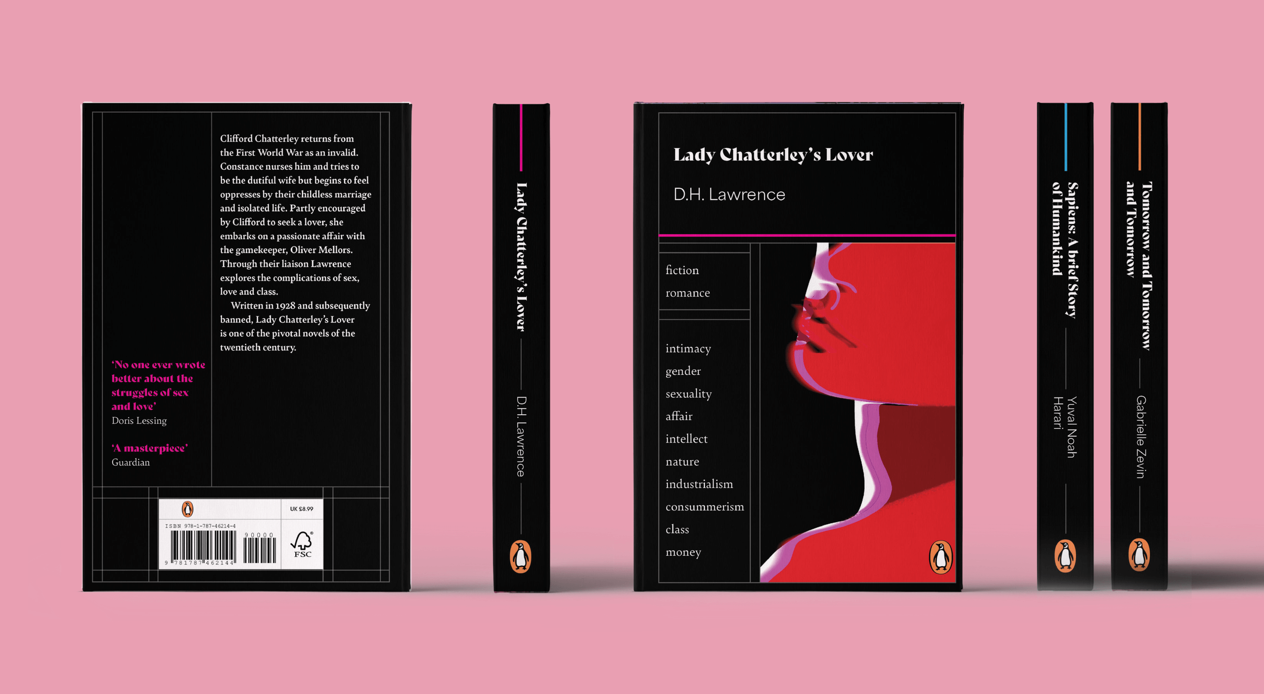
This series’ idea is linked to a problems I have encountered when purchasing books: the blurbs being misleading and the lack of trigger warnings.
My design uses 10 words/tags that describe the books’ themes and meanings, giving the reader a well rounded view of what to expect without spoiling it. The table-like approach and colour coding are simple and inspired by cyber-brutalism, the font highlighting the modern approach.
My design uses 10 words/tags that describe the books’ themes and meanings, giving the reader a well rounded view of what to expect without spoiling it. The table-like approach and colour coding are simple and inspired by cyber-brutalism, the font highlighting the modern approach.

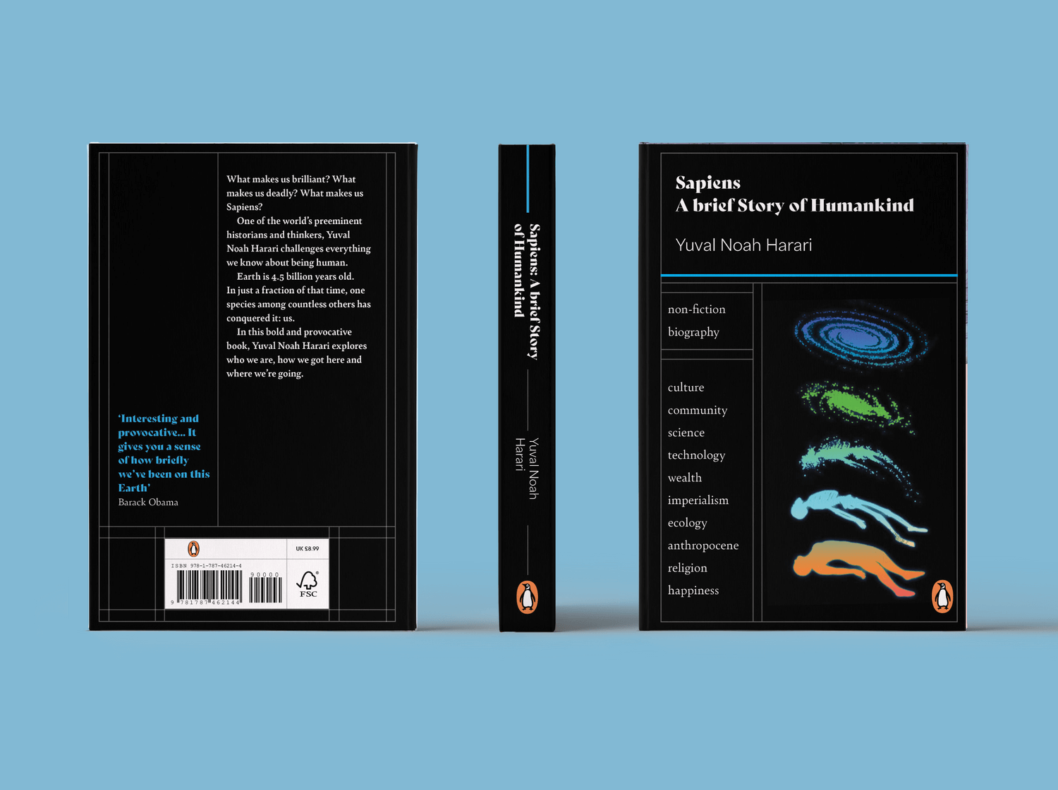
I explored multiple ideas during my idea generation process, some that emodied the Penguin style better, but I decided to go for the boldest of them. The design is simple yet it pushed me to try to implement something unusual on the book cover.
The colour coding exemplified in my design is as such fiction (orange), non-fiction (blue), with the potential for popular subcategories like romance (magenta).