
Complex Texts
mass-market // classics
The series look needs to have a fresh andappealing feel in order to attract its audience, offer
a comfortable reading experience and clear navigation.
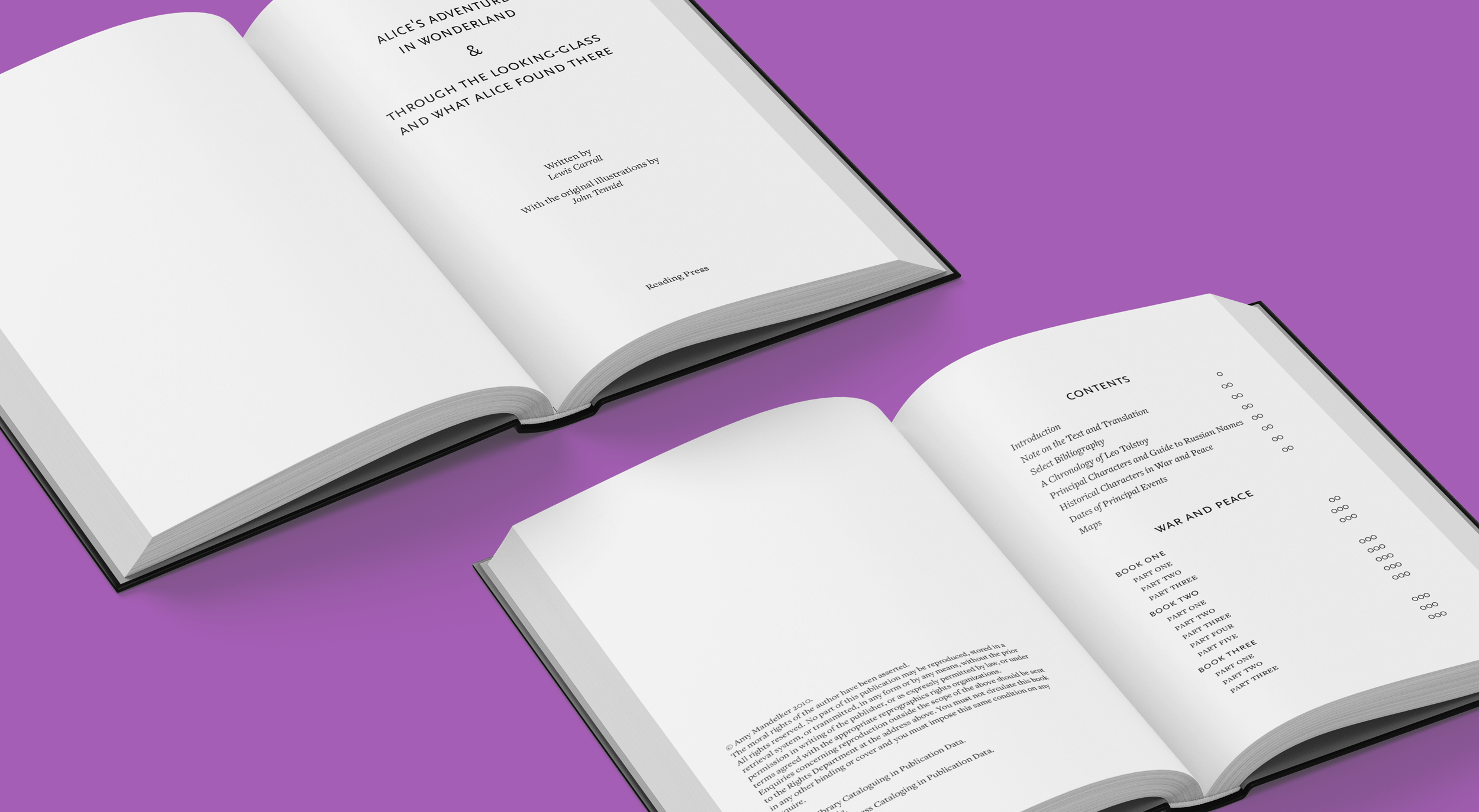
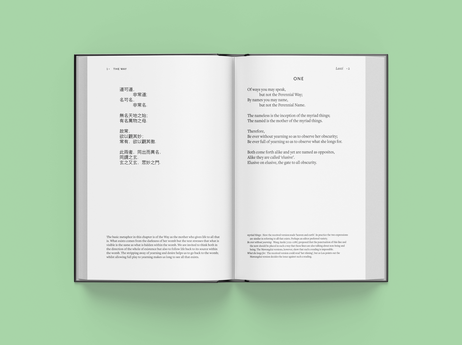
Keeping an universal feel that works with books of any genre is important as the series needs to adapt well to the variety and legacy of the classics. Therefore, I approached the modern look with a sans serif/ serif pairing.
Keeping an universal feel that works with books of any genre is important as the series needs to adapt well to the variety and legacy of the classics. Therefore, I approached the modern look with a sans serif/ serif pairing.


This project has taught me a lot about
micro-typography, text hierarchy and readability. It has given me a good understanding on complex text design as much as it did on the difference between series design and a one-off design, what works and what doesn’t.
In unifying my design, I realized that sometimes less is more and the main elements, if chosen well, will speak for themselves in creating a certain visual language.