


Essentials: Franz Kafka
series design // fiction
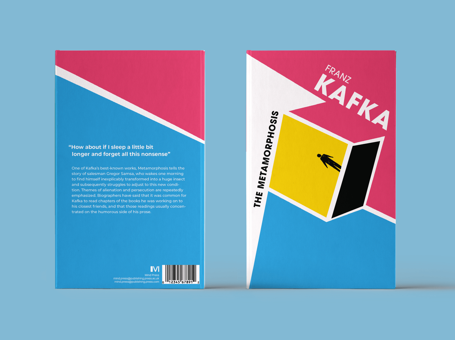
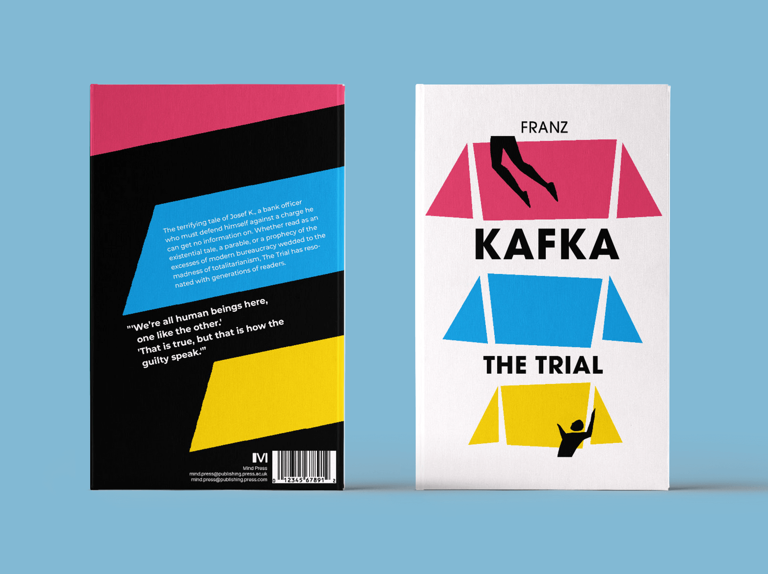
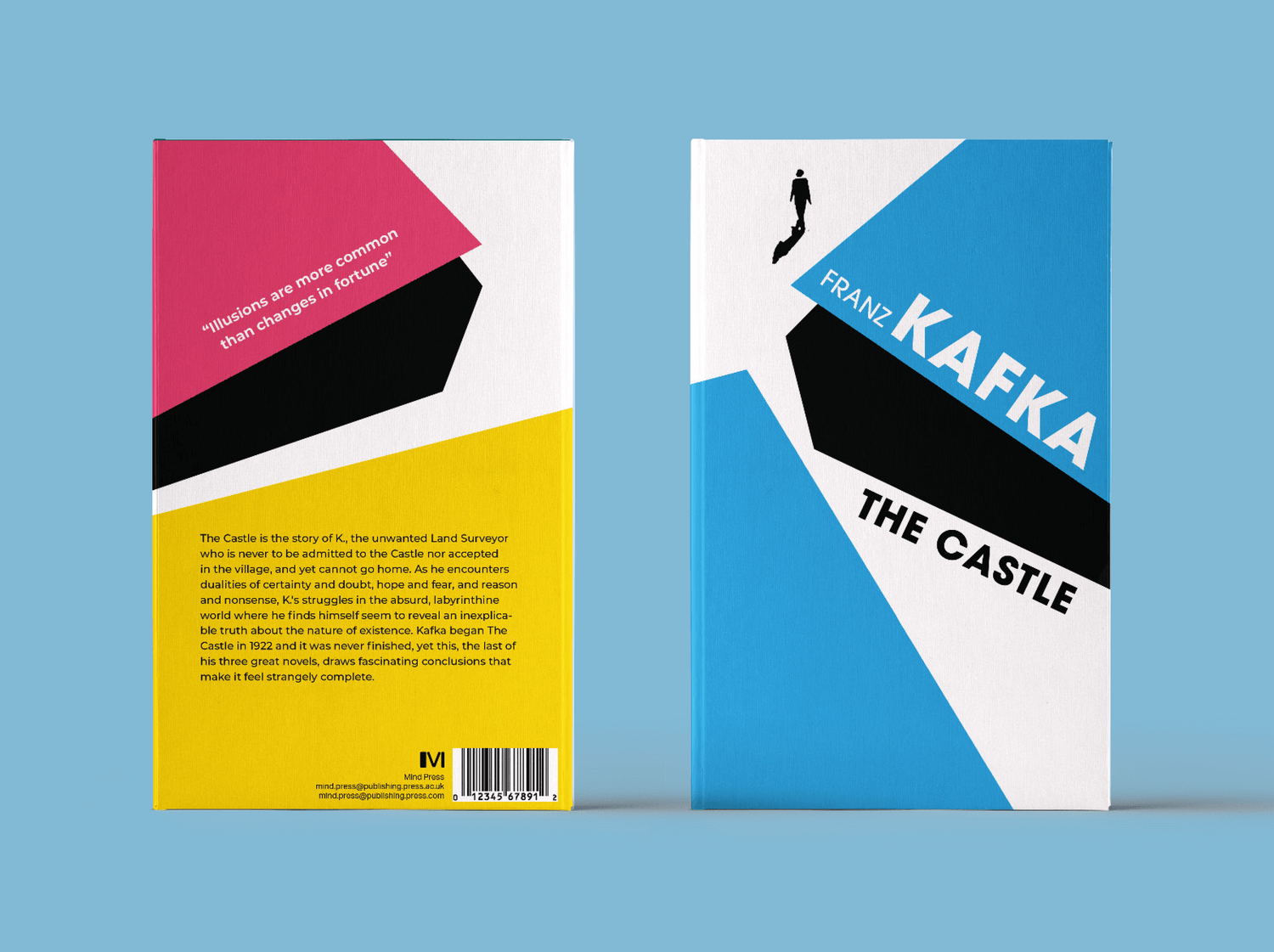
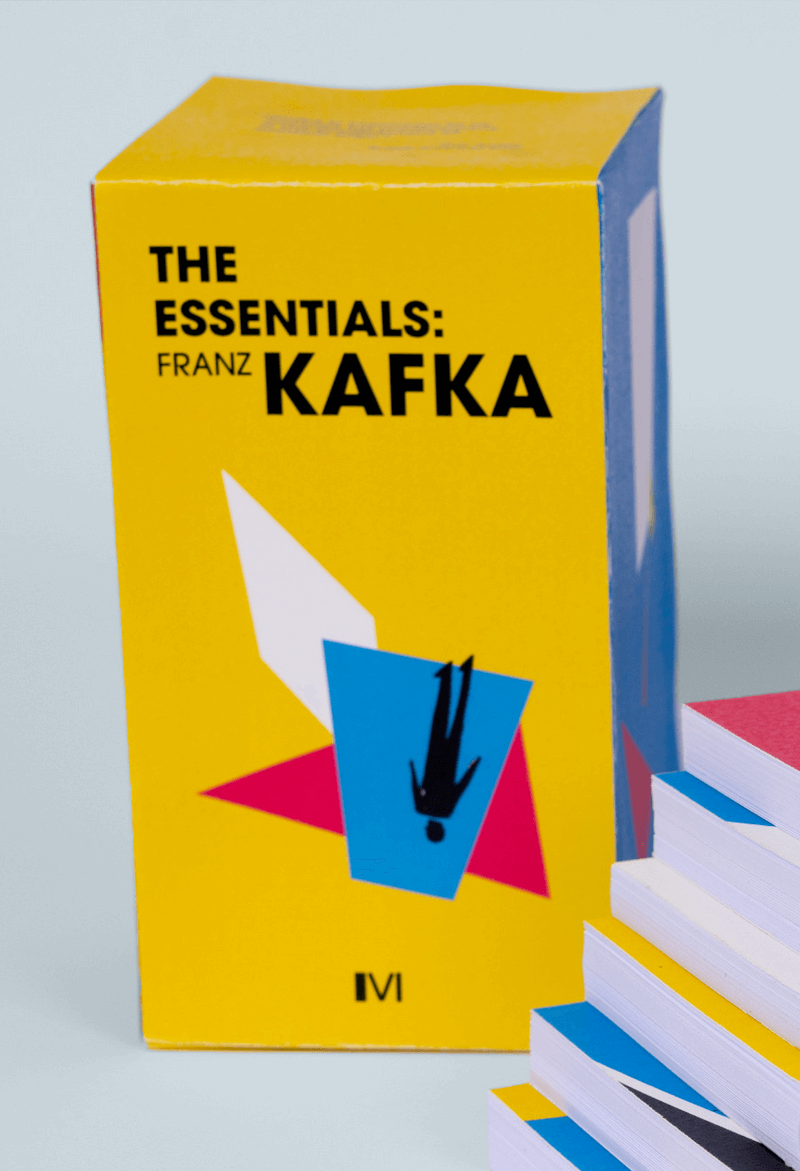
The covers are done digitally based on paper cutouts, while the figures are drawn in pencil in order to highlight the tension between the man and the artificial environment.
The colour palette is also meant to suggest this surreal, far from nature atmosphere, in which the man cannot find himself. The series is published under Mind Press, a speculative, self-designed publisher related to Mindfulness Press.
The colour palette is also meant to suggest this surreal, far from nature atmosphere, in which the man cannot find himself. The series is published under Mind Press, a speculative, self-designed publisher related to Mindfulness Press.


The elements forming the series are:
the fixed colour palette, the small silhouettes,
the geometric shapes, irregularity in line
quality, block of white.
the fixed colour palette, the small silhouettes,
the geometric shapes, irregularity in line
quality, block of white.
The colours used in the series are also chosen as to stand out from the other published Kafka covers, that usually have a sombre approach. I wanted the covers to bring to surface the tragicomedy aspect of his stories.

What I wanted to achieve with this
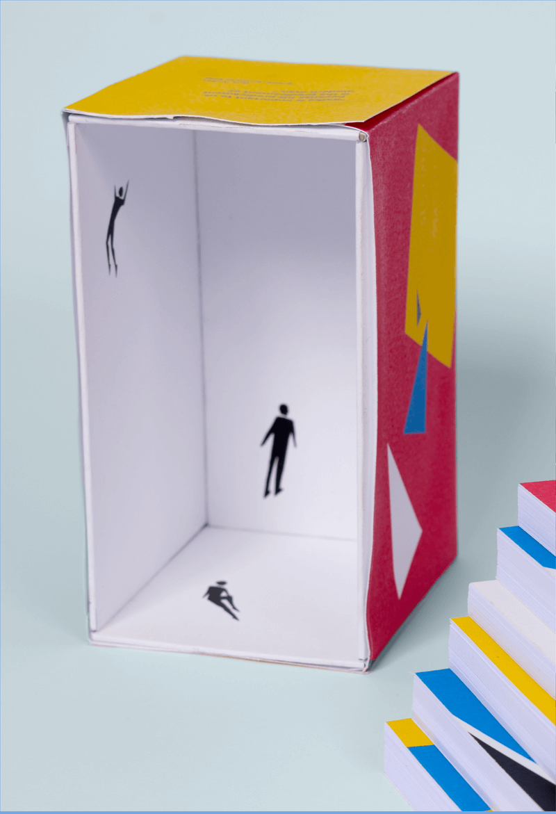
series design is to bring out the relatability in Kafka’s work, especially for the contemporary world. I think this is reflected very well with the A Format, this format making the book feel much more personal.
The design of the inside vs. the outside is also meant to emphasize the alienation of the figures in the environment.
The design of the inside vs. the outside is also meant to emphasize the alienation of the figures in the environment.