


Journeys in
the Spirit
travel guide // non-fiction
As part of Mindfulness Press (a speculative press created by me), a “Guide to:” series that focuses on spirituality through the ideas of history, culture, spirituality and travel.
Inspired by the atmospheric photography I take and edit on my trips, each book a clear colour palette, highlighting the unique perspective it offers while still being accurate to the places it represents.
Inspired by the atmospheric photography I take and edit on my trips, each book a clear colour palette, highlighting the unique perspective it offers while still being accurate to the places it represents.
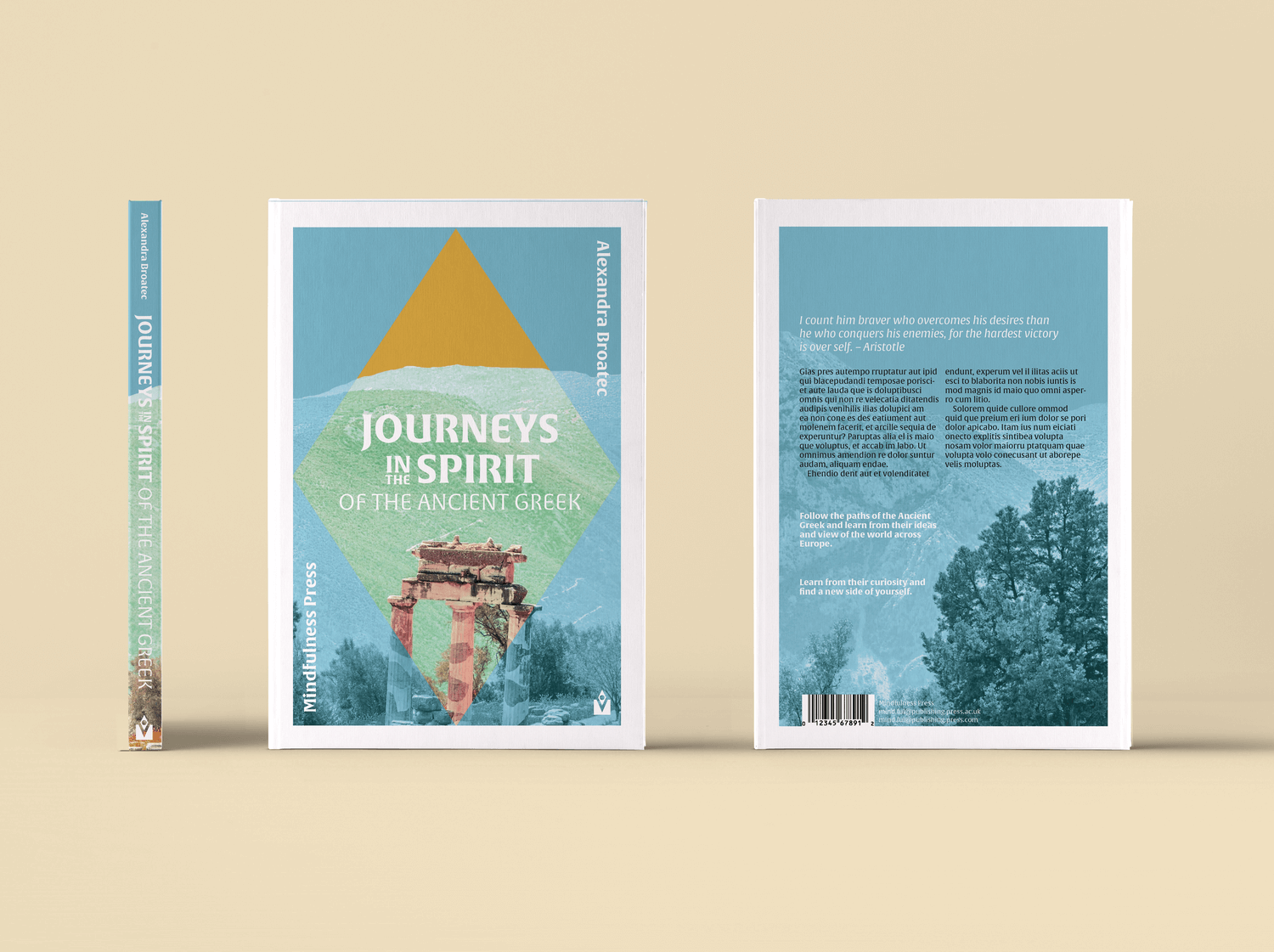
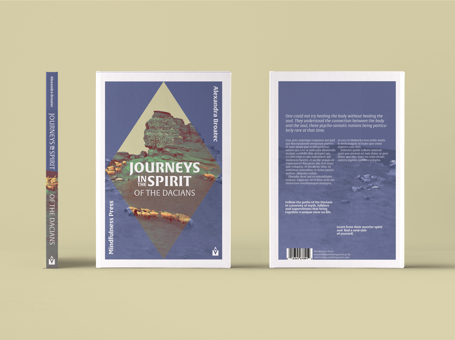
The series aims to focus on well-known cultures to introduce new audiences as well as niche cultures
for the passionate.
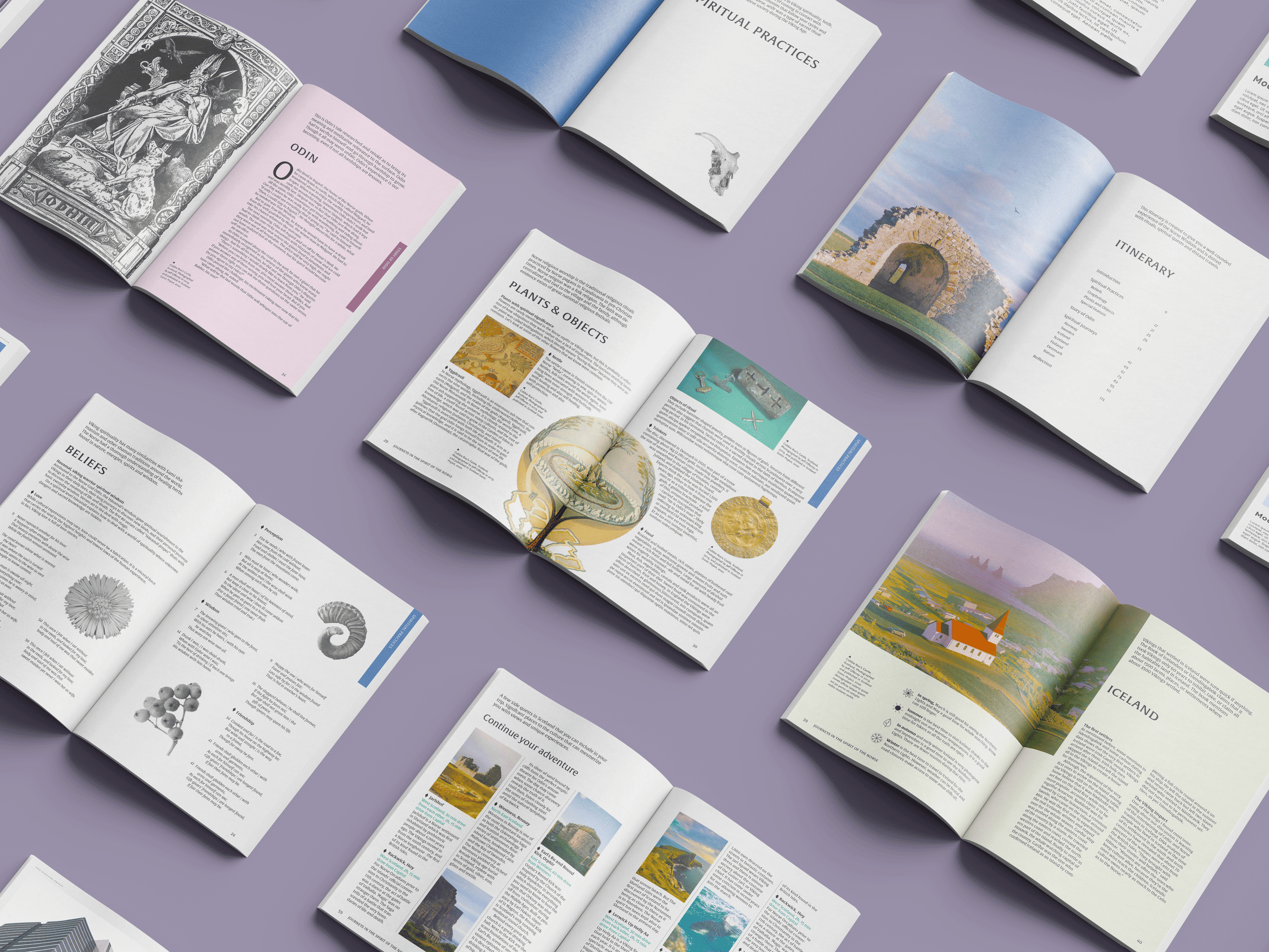
The concept of the covers employs the idea of the eye as seeing within and beyond, connecting to the series’ aim of allowing its audience to dig deeper both in these cultures and within themselves.
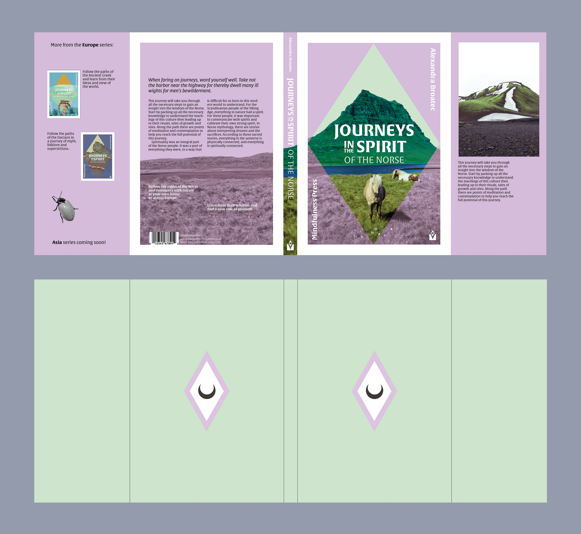
The cover has flaps directed towards marketing and presenting the other books of the series. The symbol of the “eye” is iconic and ,blended with the symbology of the moon, it represents the core meaning of the series.
This meaning had to be translated in the book’s binding, as well. Therefore, I decided to use exposed binding, giving the book a journal-like aspect, making it seem more personal. Moreover, I chose paper that would have a nice texture for that natural feel related to the themes of the book.
This meaning had to be translated in the book’s binding, as well. Therefore, I decided to use exposed binding, giving the book a journal-like aspect, making it seem more personal. Moreover, I chose paper that would have a nice texture for that natural feel related to the themes of the book.